
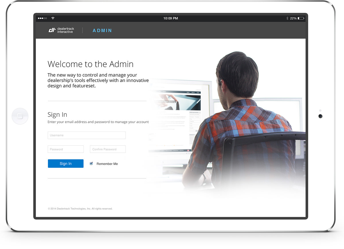
Challenge
This admin was one of the most significant projects I’ve been involved in. It needed a full-scale, ground-up redesign with a totally new software stack as well. We were to design and build a new tool that would allow internal teams and external customers to make massive updates to their websites in an efficient way so that it would replace the existing tool that required users to update all assets one at a time, one website at a time. Oh yeah, it had to work on mobile devices, too.
When I joined the project it was already underway with significant research done on existing practices and my role in the project was to improve the UX and IA, as well as guide my team of designers to help with the visual design. Some of that work is below and credited to Chris Alexander, the designer responsible for that work.
Approach
The team adopted scrum, and my work happened before developer sprints. I began my research learning the existing tool, and evaluating the existing information architecture. I interviewed key team members, and audited the content. I reported my findings to the team, and leadership. I also worked with team members to refine personas.
During the project, the team tested out multiple approaches to the navigation structure, and iterated on prototypes using a combination of real working code and clickable InVision prototypes. We tested out the functionality internally with teams, and externally with important customers.
I iterated on new workflows in the tool based on user research, and identified ways to improve the daily work of our users. We also tested out novel ways of interacting with updates to existing content that ultimately lead to some deep understandings gained for later iterations.
Impact
After several months of work, the team had an MVP we tested with internal implementation teams, and presented to important customers. Based on what we were able to present, we kept an important relationship with a major customer, and work continued on the tool for several more months, significantly improving the speed and ease of use from internal teams.
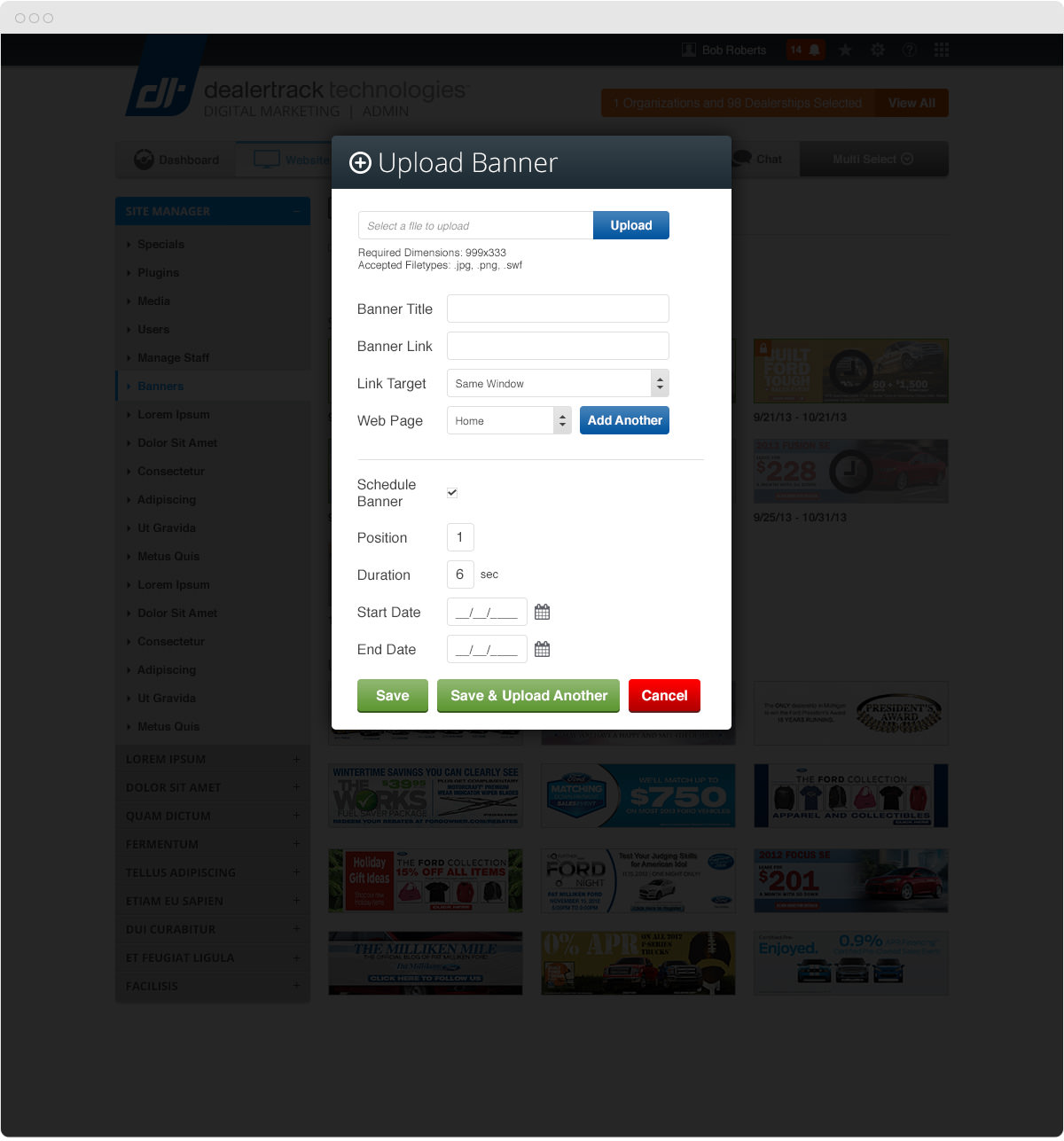
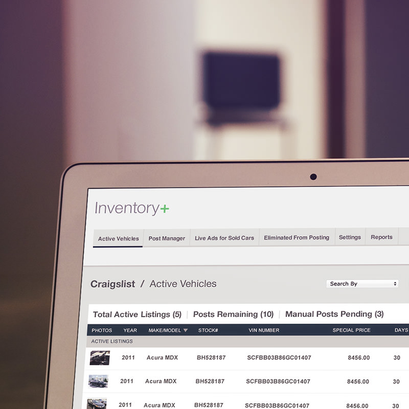
These screenshots demonstrate challenging selection techniques, and complex information structures.


Banner management needed a way to demonstrate scheduled vs. unscheduled banners, as well as scheduled and live vs. scheduled and queued banners.

View Another Project


Want More Color?
Sign up for my infrequent emails on ux, design, and color.
Enter Your Email Address